Tuesday 28 February 2012

UFO B-movie scene

Here is some sketches for the B-movie UFO crash scene.


The scene would be set in a warehouse, with a section changed with a fake UFO and backdrops. There would also be film equipment and various other things. The area would be blocked off by warehouse walls.

I really like the twist in the UFO crash here, as I am using cliche UFO visuals, it should also be pretty easy to model.

Floating Island Moodboards

I have decided to develop my fairytale idea. As the location can only be a limited size, I decided that a floating Island in the sky could be a good idea.

I decided to make some mood boards for how I'd like the island to look and what style i'd like it to be.

Already I have begun to develop some ideas, using crystals, wings and vivid colours. I would like to do more development for the building on the island, I'll need to know who lives there and how this will reflect in the building.

Ideas mind map.


I have made a mind map showcasing some ideas that I have for the location. I am not sure I I want to the the Kirkstall Abbey location as I think I could do better with a more imaginative and unique location.Ideas that I quite like are the B-movie style UFO crash and the floating island.

Monday 27 February 2012

Design Inspiration and Gathering Material

When looking for inspiration for my game environments, it is important that I look from a variety of sources. While we have three options to choose from (crashed UFO site, fairytale scene, Section of Kirkstall Abbey) they still provide room to be imaginative and creative with them (with the exception of Kirkstall, which is a recreation).

I shouldn't simply look at other video games for inspiration, I should also look into all forms of media and real life for my environment. Since the environment I will be creating will not be a game and simply an area to walk around, I can afford to put a lot of effort into how the location looks.

While looking at mainstream AAA video games for inspiration is good, I should also look into the independent side of gaming. Since they often don't have to worry about publishers and making massive profits, they can be free to make more unique and stylised games.

It is also important to develop my ideas by drawing in my sketchbook and doodling on the computer with a tablet. While I may initially think these drawings aren't so good, they are important for the development of the ideas and don't need to be perfect drawings.

A good idea for gathering materials would be to create mood boards for my ideas. That way I can identify key elements and moods for the environment I create very easily. It is also good for communicating me ideas to other people.

Small Unity level


Unity Web Player | Web version

This is a small test area we have created in Unity. It is not much but already it demonstrates a variety aspects. There is light and shadows, invisible walls and first person controls.

Obviously when creating our environment, it will be a lot more detailed and larger.

Friday 10 February 2012

Space Stallions

When making and watcing animation, I personally prefer 2-D animation, though I may be biased form my experience with 2-d animation and only starting 3-D animation recently.

Recently I found an animation which blends 2-D and 3-D animation very well. A cartoon made by The Animation Workshop called 'Space Stallions'


Much like the animations from Harry Partridge, this pays homage to the Saturday morning cartoons of the 80's. It uses 3-D for the characters with a cel-shaded look and 2-D graphics for the special effects. The combination works surprising well and doesn't seem jarring as I'd expect it to be.

The animation is very high quality and smooth and the aesthetic is pitch perfect with the 80's cartoons it is trying to emulate. This shows that 2-D and 3-D animation can be combined with success.

Sound Design

I didn't want to use any music for my animation so I decided on just using sound effects. We booked out the recording room to make our own sound effects there.


I decided to make my own sound effects because I knew how I wanted the animation to specifically sound like, I knew it would be easier to just create this sounds rather than trying to find something similar.

I altered some of the sounds a created, such as deepening the crashing sound of the big toys footsteps, or changing the pitch of the small toys footsteps.

I also altered the volumes for the sounds to make them seem close or far away.

Animating the toy

Finally it was time to animate my toy. I decided to animate my toy in separate scenes, which would allow me to change cameras quite easily and ensure that a single file wouldn't get too big.

First I animated a walk cycle, I tried doing it in how I explained it in the storyboard, however this proved to be problematic.


This walk cycle was too cumbersome and slow for the scene I wanted to portray. I decided to make a new walk cycle that was more of a shuffle and could be faster.


This walk was much cleaner and faster, which would suit the small toy well. I decided I would keep the style of walk for the big toy as it was needed for the last scene to work.

Most of my animations would be the walk cycle plus starting and stopping, so I could re use this animation a lot. I used the infinity tool in the first scene of my animation to make an infinite walk cycle.


For the bigger toy I used some squash and stretch for his footsteps, to make him seem more heavier. I used the same thing for when the small toy jumps into the big toys foot.

I decided that when the big toy falls over that the scenery should jump up, to show just how heavy the big toy was. I made a small test animation to see how this would look.


The hills would need to be a lot smoother but I thought that it would be good to put into the final animation.

During the final parts of the animation I did start to rush a bit, as I needed time for the animation to render out and I was under pressure from other work, I felt like I could of done the ending better if I had more time.

With all the Maya work done for my animation I made some quick title cards using flash.

Modelling the Toy

Now that my storyboard and animatic has been set up and now start modelling out my character. First I took reference photos of my toy to help model it.


I put these photos into Maya and started modelling. I started out with a cube and began changing the vertexes to match the toys shape. I then used other cubes for the ears, arms and feet, altering them to the shape of the photos.


This was my first attempt at modeeling out my toy, unfortunately it doesn't fit the toys parameters perfectly as I had not made my reference photos the right size, however I feel that it is close enough to the toy it doesn't matter. Here I have placed a simple colored bevel on my model, the final one will have a UV texture over it.

I made a UV map of my model by grouping it all together, I then made points across the back of the model and locked them in place. I then 'unraveled' the model to produce a flat shape, which was my UV map. This was very difficult for me and I required help in doing it.

I created a texture map for my toy, however when rendered it came out stretched out. I remedied this by making the details of the texture more narrow.

This came out a lot better.
While modelling my toy, I also tried making a model for my background.

I used simple spheres for the hills and a plain for the ground. I was originally going to use another plain for the sky but decided against that and decided to place a background in after effects.

Storyboards and Animatic

It was time that I produced a storyboard for my animation, I needed to make sure I kept it simple enough so I could animate it easily.


I produced a rough storyboard in my sketchbook,  A small toy will walk into the scene, then a large toy will walk into the scene, the big toy will walk forward but the small toy will run underneath his foot and knock him, causing him to fall over. A simple animation that I could produce with my skill level.

   I then produced a cleaner version on photoshop, I made the background a rolling vista of link hills to fit with my character design.

Finally I produced an animatic to help me figure out the timings for my animation.


Lighting

Today we learnt about lighting and how it effects the scene in Maya. Essentially it is the same in film as it is in 3-D; it is important to utilize 3 point lighting to help whatever you are lighting stand out.


The three lights you need to use are a key light for the main lighting, a fill light to help balance out the other side of the object and a back light to help soften out the edges of the object.

In Maya there are different types of light that can be used. A directional light can be used to simulate sunlight and effects the entire scene. A spot light is a cone shaped ray of light, much like the ones used on stage. A point light is floating orb of light which shines in all directions. It is important to use all of these type of lights if you want something to look well lit.


Here I used two spot lights for my key light and fill light, then I used a point light as a back light for the object.

BarfQuestion

I wanted to try and find some animators which worked with a more traditional style, I remembered an animator which both works almost exclusively in hand drawn animation and I am a big fan of: BarfQuesiton


BarfQuestion's animation use almost childlike drawings drawn with pencil crayon, every frame is redrawn to have a constant wobble to it, even the backgrounds. I can only imagine how long each animation takes to draw out, especially since there are no layers to help with individual character animation and background animation.


I really like BarfQuestion's animation, combining simple drawings with a weird creations, all animated by hand. It shows his skill as an animator that all his animations are smooth and enjoyable to watch.

I should remember that any animation can be high quality and doesn't require computer equipment to reach its full potential.

Stop motion

When I think of stop motion, I immediately think of clay animation, however there are in fact many forms of stop motion animation and all of them differ quite a lot.


Strata cut animation for example involves taking cuts from a block of clay and talking an image of each one, producing an animation. It produces a very unique look and is something that is rarely seen these days.


Pixilation is where a stop motion animation is created using photographs, this can allow the movement of inanimate objects and make things seem a lot faster than they are, such as in the brilliant Wizard of Speed and Time.


Pinscreen animation is something that is rarely seen. Animation is created by altering the points of tiny pins, creating an image. This must take an incredible amount of time to do and gives the animation a surreal quality about it.


Graphic animation uses cut outs and hand drawn images moved around by hand to create an animation. Obvious examples are the animations of Terry Gilliam from Monty Python and South Park. While the animation is very simple, it still offers appealing characters.


Object animation uses things such as action figures, lego or any object to animate something. The best example is The White Stripes music video 'Fell in Love with a Girl', which is one of my favorite music videos of all time.

All of these animations are stop motion and all of them offer a unique style. I will have to make sure I look into more into these other methods of stop motion and not just clay animation.

Motion Guides

Today we learnt about motion guides and how they can be used for our animations. Motion guides are very easy to create and allow complex movements to be created quite quickly. For the exercise we used the same truck we modelled before.


To create a motion guide, all you have to do is draw a line in the top view, this line would automatically round the corners for where you pointed, ensuring a smooth movement. It is then as simple as attaching the truck model to the motion guide and setitg how long the animation takes.
It is also important to set up the correct axis for the motion guide, as the truck might move to the side or reverse if wrongly inputted.

Motion guides are perfect when using a mode of a car. I will personally not be using motion guides as I do not need such complex movements in my animation. Still, it is a useful skill to know  and I may use it for future modules.

Cyriak

Recently we attended a talk by the animator Cyriak, which I found as an excellent opportunity to look into his work.


Cyriak is a 2-D animator who primarily uses aftereffects and photos for his animations. Almost all of his animations involve manipulated photos and grotesque transformations. I personally think that Cyriak's animation is brilliantly bizarre and fantastically produced.


One of the main themes of Cyriak's animations is cycles, often his animations involve large complex movements that loop seamlessly together. This must take excellent timing to keep in sync, especially when combined with other cycles, like in the video above.

 will not be producing something so complicated as this, but I will make sure to take into consideration the timings of my scenes and how they play out with over movements.

Pendulums

We have been practicing more with Maya, using more principles of animation in our sessions. We have been using pendulums to showcase this.


In this animation we practiced slow in and slow out. The speed of the pendulum shouldn't be constant throughout the animation and should slow town when it reaches the top of it's arc.


In this animation we utilized overlapping action, the top of the pendulum and the bottom of the pendulum are not going at the exact same rate, which shows or more fluid and realistic animation.


Finally, we practiced using Follow through. Unlike the other pendulums, this one moved in a straight line and came to an abrupt stop. The bottom of the pendulum would not stop instantly with the top. Instead it would carry on for a little while and swing. Using this principles of animation I can create much more dynamic and interesting animations. 

The Principles of Animation

When working with animation, it is important to know about the 12 basic principles of animation. The principles were set by Disney animators to make sure they make there cartoons move realistically but also in a way that is appealing. While the principles were originally set for 2-D animation, they still apply to 3-D animation quite perfectly.

1. Squash and Stretch

Squash and Stretch is when an object or character squishes into more compact shapes or stretches into elongated shapes while maintaining the same volume. This can be done in a realistic manner but also can be over exagerated., this would be useful for adding humour to animations or giving something a more organic feel.

2. Anticipation

This is where something prepares to move before setting off. This could be the bend of the knees before jumping or leaning backwards before falling over. Not only does this add a sense of realism to animations, but also keeps the audience waiting and anticipating what happens next.

3. Staging

Much like film, animations need to take into consideration what is on frame at the time. Things such as establishing shots and high angle shots still apply in animation and should be make the animation as clear as possible. this is a lot easier in 3-D animation as the camera can be moved freely in the scene, while 2-D animation has to be redrawn.

4. Straight ahead action / pose to pose

This relates to either drawing out an animation from start to finish or drawing key poses and filling in the blanks in between. While drawing from start to finish offers a more fluid solution, the proportions of the drawing change while drawing. Pose to pose maintains a more accurate drawing throughout but is less fluid. This principle applies more to drawn animation than 3-D, as the proportions can be easily locked for 3-D.

5. Follow through / overlapping action

Follow through refers to how movement can still occur even if a character or object stops (e.g. swinging of the arms when someone stops running), while overlapping action refers to different movements happening at the same time at different rates (e.g. the swinging of a pendulum). These principles are both very important in showing realistic and smooth animation, in both 2-D and 3-D animation.

6. Slow in / slow out

In real life, things don't move at a constant speed all the time, things slow down and speed up when moving, this principle is about emulating this. By making an object start slow and build up speed, it produces a more realistic animation.

7. Arcs

Almost everything moves in arcs. Very rarely does anything move in a completely straight line and animation should reflect this. When walking, the character should bop up and down. Unless you are animating something  mechanical like a robot, you should avoid straight movements at all costs.

8. Secondary Action

Secondary action is where there is another movement that accompanies the main movement, for example, talking while walking. I will not be making much use of secondary action as my animation will be very simple.

9. Timing

How long certain animations and movements last. This is important for my as I need my animation to be a specific time long. It is also important to considering how long each movement should last, a walk cycle for example should be quite fast and not take long.

10. Exaggeration

One of animations greatest strengths is the fact it can portray the physically impossible. Certain movements can be exaggerated, such as stretching out an arm to massive lengths or squashing into the size of a puddle. It is important to not over do this however as it may look too odd to the viewer.

11. Solid Drawing

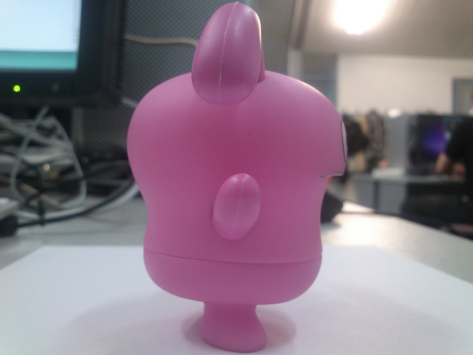
Solid Drawing takes into consideration how 2-D images can seem 3-D and how proportions of characters should be realistic. This principle doesn't apply to my animation as I am using a toy to animate and am already using a 3-D software.

12. Appeal

All characters in animation should hold some appeal, this can be achieved by making the character seem believable and interesting.

I will try to utilize as many of these principles of animation in my own animation, to ensure it is appealing and enjoyable to watch.

Thursday 9 February 2012

Happy Harry Toons

When looking for animation artists I knew it was important to take in a range of styles and practices. When looking for 2-d animation I was reminded by the animations of Harry Partridge.


Harry Partridge is well known for his dark sense of humour and smooth flash animations, he was one of my inspirations to look into 2-d animation and start practising in flash and I personally think his work is great.

His animations often use realistically proportioned characters well drawn and animated very fluidly, something which is very hard to pull off. he also emulates the style of cartoons from the 80's a lot with it's cheesy introductions and kid friendly themes (despite the subject of the cartoons)


Emulating something like this in Maya would be next to impossible at my level of skill, but I will definitely use the same principles of animation that Harry Partridge uses in his animations.

Bouncing balls

We have been doing more animation in Maya, this time exploring gravity, and how to animate objects to make it seem realistically effected by it.


We practices with a ball and how it would bounce when hitting the floor. A ball wouldn't simply drop to the ground at the same speed and instantly stop, so we made it build up speed and bounce off the floor. Similarly, it wouldn't start slow when going back up, so we altered the graphs to make sure it kept it's speed when bouncing, slowing down when it reached its height. We made the ball bounce lower and lower to reflect how it would look in real life.


We also looked into how the weight of a ball might effect how it animates. The ball on the left is very heavy, while the ball on the right is very light. The heavy ball drops faster than the lighter ball, and only bounces a small amount. The lighter ball takes longer to reach the ground and bounces a lot more.

I will have to remember to utilise gravity and weight when making my animation so the movement don't seem awkward or fake. 
  

PeepholeCircus

While looking for 3D animators for insipration, I found a channel called PeepholeCircus on Youtube with very dynamic animations.


The style is almost like a 3-d version of 8-bit graphics, using very angular shapes and mostly cubes for characters, I really like it as it shows you can make nice looking characters with simple shapes.


My favourite part of PeepholeCircus' work is how smooth and fluid the animation is. Despite having blocky and simple characters, they all move very naturally and smoothly. I would like to be able to animate at this level but I doubt I have the experience to pull it off.

The youtube channel is http://www.youtube.com/user/Peepholecircus and I highly recommend everyone give it a look!

ANIMATRONICATING

After learning about modelling we then learnt about animating in Maya. Animating in Maya utilises graphs to move objects around the workspace.


First we key all of the types of movement we want to capture (rotation, changing size, etc.), we then select a different frame on the timeline and move the object. The graphs will change to reflect the movement.


The animation can be fine tuned by entering the graph editor and changing how the lines go between each key frame. I a  finding it a little difficult to animate as I am used to drawing in-between frames for 2-d animation, but I am sure I will get used to it in due time.

Wednesday 1 February 2012

Group communication

Apart from the times when we were in college, we couldn't easily communicate with each other, as we all lived far away from each other. To counter this, we set up a Facebook group to ensure easy communication for the entire team.


This was incredibly useful for organizing times and dates for filming. We also made use of a Drop Box to share files around. Again, this was useful when checking animation clips with other members of the team.


Poem 2 Animating

Since I was the most practiced with animation software, it was my job to animate the character in flash. This provided some unique problems that I had to solve.


We learnt quite quickly that SWFs (Flash's main export) wouldn't work with After Effects. This would mean we would have to use GIF files to get the character into the composition.
Another problem was the lack of transparency in the GIFs. Flash did not have the capabilities of exporting a GIF with a transparent background. We came up with the solution of making the background bright green. This would essentially act like a green screen for us, that we could key out in After Effects.


Finally there was the problem of the length of the GIFs. I began work with the assumption that After Effects would automatically loop a small GIF, this was not the case however. This would mean I had to lengthen the GIF files to play for longer, but even then some problems come up.

Throughout the animation I employed a technique known as boiling. This is where the line of the character is constantly wobbling, even when still. I did this because the most important aspect of animation is movement, so to see something completely still would look wrong. Boiling ensures the animation keeps its energy, even when the character is still.


Overall the character animation took about a week to collectively finish. As it was close to the deadline I rushed some of the later animations, but that is ultimately my own fault.

Poem 2 Storyboard and Animatic

Alex drew up a storyboard for us to use in the animation.


Once again, Alex got, his friend Adam to produce the music for us. It was a lot more important for us to get the timings right for this poem as animation is a lot more time consuming than filming.

Alex produced an animatic using the storyboard.

Poem 2 Ideas

With Poem 1 in the stage of editing, we decided to start on Poem 2. We all agreed before choosing a poem that we wanted to do an animation. We also wanted to do something simpler than our first poem. We all decided to do the poem 'Isolated' by Zenam Bi.

Zenam Bi

Isolated like the emotions I have held for many years.
The cold weighs hard on my bones.
As the dark clouds begin to gather,
quiet surrounds the air.
The rural space echoes with stillness.
The picturesque image engraved in my mind.
Like a single tree embedded in a field,
The wavy grass hangs around to help ease the loneliness it feels.
The sheep wander aimlessly in this desolate sphere. 

This time, we decided to come up with ideas together as a team.


The roles for this poem were changed slightly, Alex would edit the film together, Sophie would provide background illustration and I would do all the character animation.

We wanted to keep the animation as simple as possible, so we decided to have a simple character and keep it black and white. Quite quickly we realized the drawings were similar to the art of Limbo.


The art style is very similar to want we wanted, the character is even similar to one we designed. The feeling of loneliness is quite profound in Limbo, which also fits our film well.

Poem 1 - shooting

On the 16th of January we went to York to get the shooting done for our first poem. We started around 10:30 am.


Me and Tom where there for using the camera and setting uo the positions of the actors and camera. Alex and our actress Luxi Zhou were also there to act out the scenes and make sure the scenes fit with the storyboard. Sophie was there to help out with everything and to set up the location for a later shot.


We spent the vast majority of the day filming the montage at the beginning of our poem, where the couple are happy together. This worked out well as we needed these scenes to be in the day time and the later scenes to be darker.
We were originally going to have the Alex and Luci change clothes for different scenes, to give the illusion that this montage was going over different days. However, on the day of filming it was very cold and needed to wear a lot of layers at the time. We decided to keep the clothe changes to a minimum due to the weather.


We managed to get interior shots in a coffee shop fairly easily although the first time we went it was far too busy for us to film in. e returned a couple of hours later, after having a lunch break to film this scene.


Since we were not going to have any dialogue in the Poem, the actors could talk about anything they wanted during filming, as everything was going to be muted. This allowed for some naturally looking acting.


We filmed happy scenes right up until sunset. We planned to have a timelapse of the sun setting, with the city in the foreground, however we all agreed that York didn't fit the bleak look we wanted for that timelapse. Tom would do the timelapse himself at a later date.

We then went to Sophie's house to film the final night scenes. By now it was 5:30 - 6:00 pm and very dark. We underestimated how dark it would be for this scene and the shots we filmed were very hard to see. We needed more scenes in a lighter time of day anyway, so we agreed to film the night scenes the next day in Leeds.

We once again all got together in Leeds to film the last scenes, we went into the city center, around 4:00 pm to film the sad scenes of the film. Leeds is a lot more busier and bleak than York so it fit better than if we filmed them in York. We used Luxi's home as a setting for the last scene. This time we rented out a light to help make the scene visible. This time it ended out a lot better than the filming in York.

Poem 1 Inspiration

Our first video was about forbidden love, so we researched similar videos for inspiration.


At first I was quite confused with this video but still intrigued. It features a very belated man going backwards through time. Throughout the short film we are revealed how he got so messed up and what ridiculous things he had done. At the end it is finally revealed why he is so happy: he had just successfully proposed to his girlfriend.

It is a very heartwarming film which keeps you interested through to the end. by making the film go backwards the audience is left guessing as to why he is so happy so continues watching.

As a group we toyed with the idea of making the video be in reverse order, to keep the viewer interested, we decided not to however. Our film would also be a lot sadder than this film.


This film fitted a lot more with the emotions we wanted to show. In this, a montage of happy memories shows, while being juxtaposed with much more sadder scenes at the end. The difference in colours between the memories and present day are very clear, making the switch between scenes all the more noticeable.

Sophie also produced a mood board to fit with the video we're making.


Instructional video Inspiration

I took a few inspirations for my instructional video, most notably, Stuart Ashens.


Stuart Ashens does video reviews of old or fake electronic games and equipment, almost all of his videos take place in a first person perspective, with his hands coming from the sides of the camera. He narrates over each review, giving a funny commentary for each fake toy or game. I have taken a lot of inspiration from Ashens, such as wearing a suit for the video, having some first person perspective shots and utilizing a similar sense of humour.

I also took a lot of inspiration from 5-Seconds films.


5-Second films make a 5-second video every weekday, collected all of that week's videos into a collection on the weekend. Occasionally they produce and short film. I think the videos they produce are very funny and are a constant source of entertainment, they influenced my sense of humour for the video and the small title cards for the video.